 Yesterday, Majestic released new jerseys and hats for all MLB teams for Spring Training. Many teams got entirely new designs, while others simply received minor tweaks. Every team, however, will be wearing the new Flex Base jerseys. These new jerseys are lighter by about 10-20%, and feature lighter material all over, including the panels on the sides.
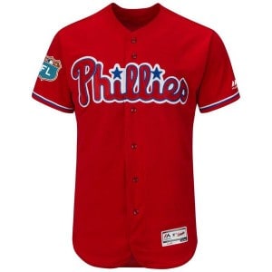
 The Phillies jersey remains largely the same as last year. It’s a red jersey with a red “Phillies” logo across the chest (red-on-red isn’t a good look), with white lettering and numbers on the back. The only noticeable differences are the blue outline on all of the logos, lettering, and numbers, and the “FL” patch on the sleeve. There are no more blue panels on the sides or the shoulders of the jersey.
If you get up close, you’ll notice that there are Spring Training designs and logos within the white part of the numbers and letters on the back. Hardly noticeable for someone viewing from the stands, but it’s a pretty cool concept. It’s been used mostly on college basketball jerseys, and occasionally MLB All-Star jerseys. Overall, I think it’s a lateral move from the old jerseys. It’s essentially the same overall concept, and that concept is decent at best. My fix, to spice up the average, is pictured left. It’s just a simple change to the color of the “Phillies” script on the front. That was posted by “PhilliesPhan1325″ on SportsLogos.net.

New (top) vs Old (bottom)
Now, onto the hat. The jersey could be better, sure, but the hat is a serious downgrade from the old Spring Training hat. (Note: At this time, it is unclear whether the new caps will also be used for batting practice during the regular season. It would be odd to have an “FL” patch on normal BP hats.) I firmly believe that a red logo on a red background isn’t a good look on a hat, just like it isn’t a good look on a jersey.
In addition to that, several other teams have alternate logos on their new Spring Training hats. The Rays are using their alternate logo that looks like a firework, the Mets are using their “Mr. Met” logo, and the Athletics are using their elephant logo. And there are many others. This could’ve been a great opportunity for the Phillies to utilize the Liberty Bell logo that they almost never use. They use it on shirts and hats on MLB licensed apparel, but not on any part of their uniform.
 I did a quick search on any Phillies hat concepts out there that used the Liberty Bell, and I found one made by user “JJHoser” on SportsLogos.net. The concept is the same as the hats that the Phillies currently have–red hat with a blue bill–but it adds a bit of variety, rather than the same logo as every other Phillies hat. I can’t recall a time when the Phillies wore a hat without the standard ‘P’ on the front.
 Another idea of mine would be to simply use another one of their alternate logos–the baseball diamond/Phillies script/liberty bell logo. MLB has licensed hats to use this logo, and I found this one (pictured right) on Lids.com. I think that would be another great hat design for Spring Training, especially if they utilize the blue brim with it.
So what do you think? Do you like the new Spring Training jersey and hat for the Phillies? Have any other alternate ideas? Offer your thoughts in the comments section.


